This article showcases the latest visual and functional updates to the Learn365 user interface (UI) and user experience (UX). These enhancements are designed to create a more intuitive, cleaner, and engaging learning environment — for both learners and managers.
The redesign is part of a broader, ongoing initiative that began in early 2024 and continues through 2025 and beyond. This initiative aims to unify and modernize the entire Zensai Human Success Platform — including Learn365, Engage365, and Perform365 — delivering a consistent and seamless user experience across all our products.
🔗 Introducing a fresh new look and an improved user experience for our products
These changes are more than cosmetic — they are grounded in real user feedback and usability testing, with the goal of making learning simpler, more structured, and more enjoyable.
At a Glance: What’s Changed
We’ve redesigned the Learn365 user interface and experience. Here are some key highlights:
- Overall visual upgrade for a cleaner, simplified and modern look
- Clear distinction between personal and team learning views
- Tabbed navigation for faster access to learning categories
- Enhanced visibility of mandatory, due soon, and overdue training
- A new Learning Path feature that guides users through structured course journeys
- New All Catalogs view lets users explore all available content in one place
- Featured categories help surface relevant training
- Updated Course Player navigation for clearer, more intuitive in-course experience
Why We Made These Changes
Your feedback has been at the heart of this redesign. Through customer interviews, surveys, and usability testing, we identified key areas for improvement. This redesign is our answer to the challenges you voiced:
- Managers struggled to separate their own learning from their team’s
- Finding urgent or required training took too many steps
- Core sections like Certifications and Transcripts felt outdated
We’re also working toward a unified visual identity across the entire Zensai product suite — making it easier to navigate, learn, and succeed, no matter which product you use.
What’s New: Before & After
We’ve broken down the changes below with side-by-side comparisons. These updates are designed to eliminate friction and make learning smoother.
1. Personal vs. Team Learning
New tabbed navigation separates:
- My Learning
Before:
After:
- Team Learning
Before:
After:
Quickly switch between views and stay focused on what matters.
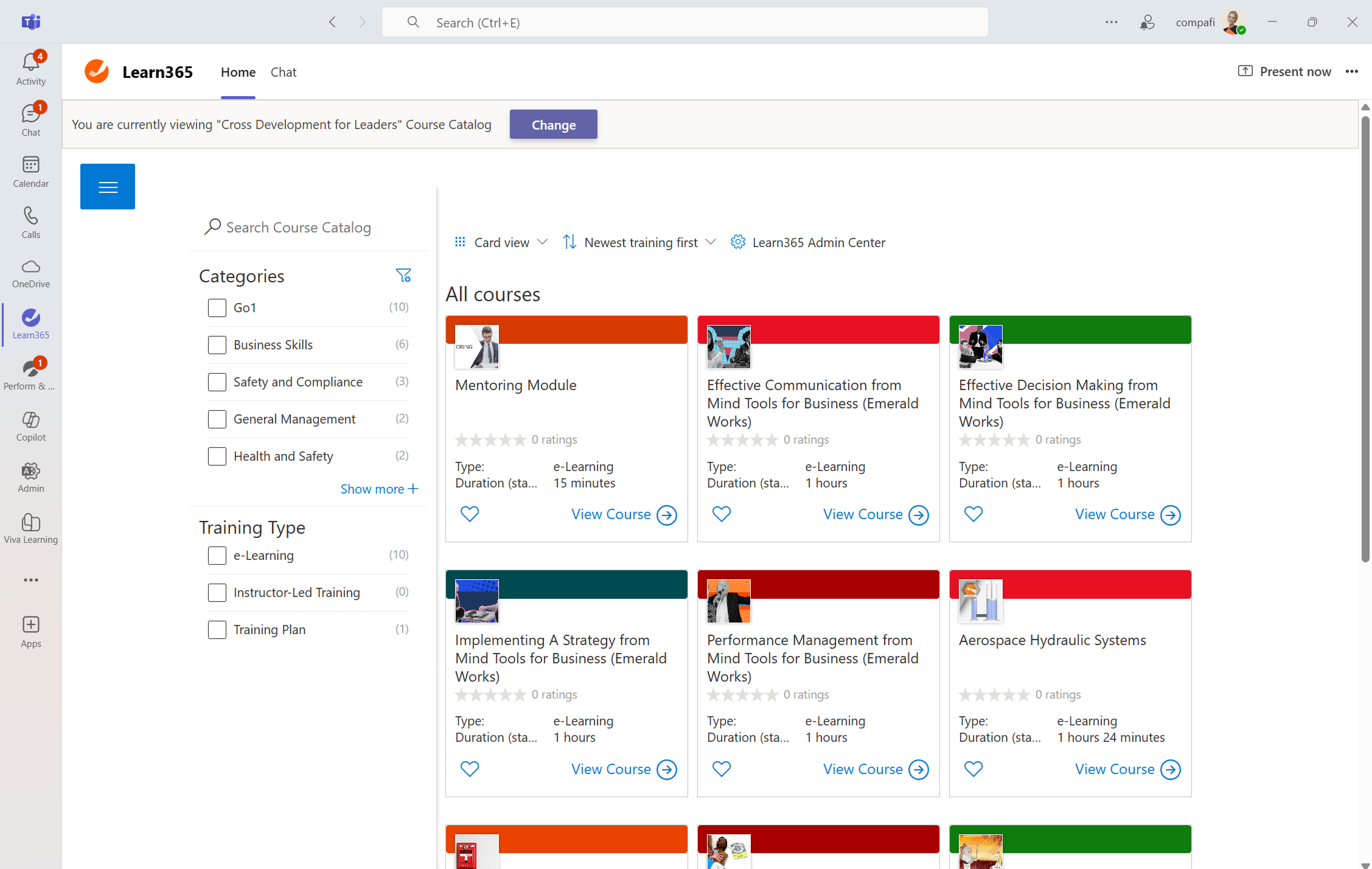
2. Catalog
- Refreshed UI for a more streamlined, modern appearance
- New ‘All Catalogs’ view shows all catalogs the user is permissioned to access – in one place
- Admins can enable:
- Featured categories to highlight specific learning topics
Before:
After:
Encourages exploration beyond mandatory learning and promotes self-directed growth.
3. My Training
New tabs show what’s urgent - instantly:
- Mandatory
- Due Soon
- Overdue
Plus: The new Learning Path feature provides structured guidance through curated training journeys.
Before:
Before:
After:
4. Course Player
- Player now features a fresh, modern look that makes learning more engaging and visually intuitive. The updated interface helps learners stay focused and better absorb content.
Before:
After:
- We’ve reduced the number of clicks and streamlined the flow, making it easier to move through learning materials. The new layout supports a smoother, more intuitive experience from start to finish.
Before:
After:
- Updated navigation layout makes it easier to get an overview
Before:
After:
A more focused and user-friendly course experience, reducing confusion and improving completion rates.
What’s Next?
This is just the beginning. We're actively working on the next set of improvements to make Learn365 — and the entire Zensai platform — even more powerful and user-friendly. Stay tuned for:
- Visual updates for Certifications
- Refreshed Skills tracking interface
- Redesigned Transcript for better clarity and usability
- A new, engaging Leaderboard experience
We're committed to delivering a consistent and delightful experience across all products — helping every learner and manager succeed.
Hi Lea, thanks for the summary, I like this a lot. It would be good to have jump marks on the page that can be linked to directly.
Most of my users do not use Learn365 in Teams but in a browser. I know not all changes have been transferred to the browser version yet. Will there be a similar overview for the browser-version or is Zensai following the Microsoft path of pressing everything into Teams, whether the users want it or not?